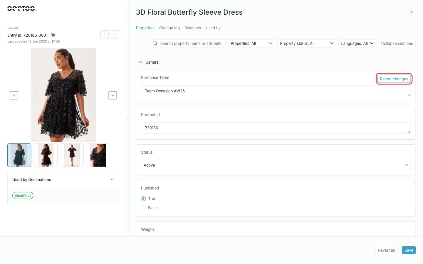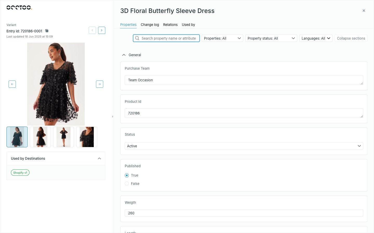
The left panel
- The card the entry belongs to, and Entry id with a copy button.
- When the entry was last updated.
- The image, taken from the card’s Image Preview or Image Thumbnail display option. When the entry has media relations, the image becomes a carousel of them.
- Used by Destinations — a badge per destination version that publishes this entry, or a note that it is used in none.
- Arrows to step to the previous and next entry.
The tabs
The open tab is kept in the URL, so an entry on a particular tab can be linked or reloaded.
Unsaved changes lock navigation
As soon as you edit a value, the other tabs and the previous/next arrows are disabled until you save or revert. Nothing is lost silently — you just cannot leave the Properties tab mid-edit.